Abbie O’Connor, Senior Designer:
- Discover why a strategic colour palette is one of the most powerful tools for building a memorable brand identity
- Learn how brand colours influence customer perception, recognition, trust and purchasing decisions
- Explore real-world examples of brands using colour psychology to create stronger market presence and brand loyalty
If you were to choose a colour that represents you, what would it be and why?
It’s important to ask your ‘why’. Then apply that same question to your brand.
Choosing your colour palette is one of the most important decisions when building a brand. It tells your audience and people who don’t know you yet, what you stand for and who you are. It signals personality.
As colour educator Juliet Docherty puts it: “Colour is the fastest way to visually convey emotion and the vehicle by which we recognise brands.”
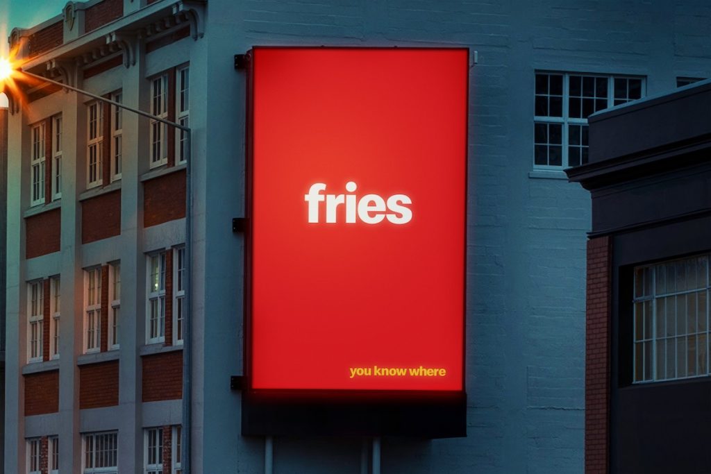
A great example of this in action is McDonald’s, which created a series of out-of-home billboard campaigns across New Zealand featuring only the name of a product: fries, for instance, alongside its instantly recognisable yellow and red. No logo. No wordmark. Just colour.
When a brand is intentional and consistent with its colours across every marketing channel, it doesn’t need its logo, people will make the association immediately. McDonald’s colours communicate happiness, boldness and energy, all perfectly suited to grabbing attention. What’s particularly clever is that red and yellow are also known to evoke hunger, which is why you’ll notice these colours dominating the fast-food market more broadly.
This brings us to an important point about colour and meaning. Red, for example, is the most stimulating colour in the spectrum: dominating, action-driving, and attention-grabbing even in the smallest quantity. But its meaning shifts significantly depending on cultural context. In UK it signals power and authority. In China, red wedding dresses are a symbol of good fortune and prosperity. In parts of South Africa, it is the colour of mourning. This is a useful reminder that colour is never truly universal.
That’s why, when defining your brand colour palette, three questions are worth sitting with:
- Who is your audience? Cultural context shapes how colour is consumed, and getting this wrong can undermine even the strongest visual identity.
- What emotions do you want to evoke? Colour signals to your audience how they should feel the moment they encounter your brand.
- Are there any practical limitations? Accessibility matters. Your colours need to work for everyone.
Get this right and your palette will feel appropriate to your audience, true to your brand personality, and effective across every touchpoint.
This applies regardless of sector or scale. Yellow grabs the eye quickly and creates warmth. Blue communicates stability, which is why it dominates banking and tech. Beige has become strongly associated with sustainability and authenticity. None of this means your brand must follow convention, some of the most memorable brands have built their identity by going against the grain but understanding what colour communicates is the foundation from which those bold choices become intentional rather than accidental.
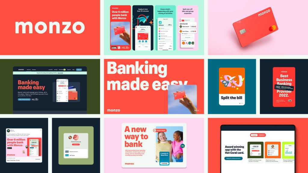
Monzo, the UK’s largest digital bank, anchors its identity in hot coral: an unmissable hue. The supporting palette is deliberately muted, giving the brand instant recognition without visual noise. It’s a masterclass in letting one colour do the work.
Colour is one of the most powerful tools available to any brand. Used with curiosity and conviction, it can do far more than simply decorate, it can define.
See how these principles translate into real-world projects in our Design Look Book.