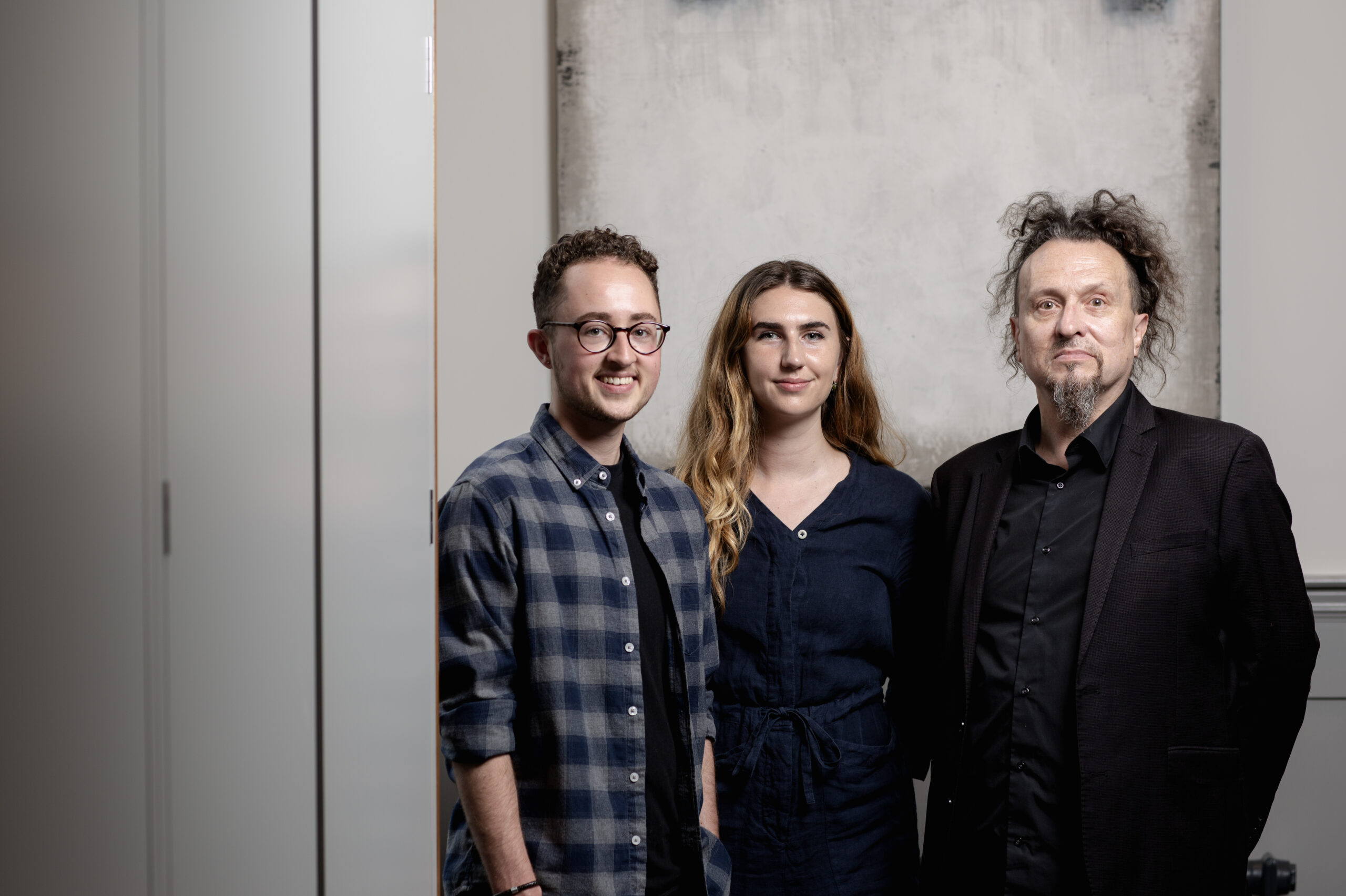
CC Design Team :
- Exploring creativity
- Our design team’s favourite illustrators
- Nostalgia, art forms and colour
In our latest blog post, our design team share their favourite illustrators and why they inspire them…
George…
A current favourite of mine would have to be Bernardo Henning. He’s an Argentinian artist who uses photography and collages incorporated with his illustrations. His work is very colourful, vibrant and full of movement. My personal favourite project he’s worked on has to be the Häagen-Dazs ice cream packaging designs because they’re so full of life.
A slightly more nostalgic favourite for me is Eric Carle. He’s probably most known for The Hungry Caterpillar children’s book. He uses painted tissue papers and collages them together to illustrate his work. I like his style because it’s so distinctive, playful and original.
Another favourite would be Norfolk-based illustrator ‘Design Smith’ (Jude). I have several of Jude’s prints in my house and am always drawn to the organised collections that are illustrated using a lot of really cool old school packaging of niche objects; things like ribbon tins and petrol cans – making art out of the mundane!
And finally, I’m very biased as she’s my partner, but Jodie Howard is another favourite illustrator of mine. She focuses a lot of her work on the use of light and creates really atmospheric scenes using gouache and pencil. Might even spot a couple of drawings of me in her sketchbooks…
Abbie…
My absolute favourite illustrator is Javi Aznarez who creates striking graphic art in a style of drawing called ligne claire. His illustrations have appeared in books, exhibitions and editorially in the likes of Vogue and the New Yorker. Especially known for his work on the Wes Anderson film poster, The French Dispatch.
Another artist that I admire has to be Kalen Hollomon, who influenced my university photography project. He creates unorthodox combinations through street photography and collages with old newspaper clippings.
Alan…
At the end of the 15th century in the Low Countries, a group of manuscript illuminators contributed to the extraordinary Mayer van den Bergh Breviary, which must be one of the most amazing illuminated manuscript of the middle ages. Each page is a prayer, for a particular time of year. The book gives its owner prayers for the year to read enhanced by the beautiful, incredibly detailed images to meditate on the meanings of the subjects, the meanings of the prayers, and to immerse the reader into the reality of the world that’s being described. It’s designed in terms of linear transitions from page to page in which the drama unfolds. The book contains not just a static arrangement of objects and images that are individually separate from one another, they’re dynamic. They fluently succeed one another and express the flow of the drama and the life of the story itself. Breathtaking.


